Saturday, 4 December 2010

Evaluation: How did you use media technologies in the...?

..Construction?
When making the film I used both digital and film cameras. This gave me a bit of a difference with the quality but I was left with no choice because the batteries died in the first camera.
With these cameras i was able to use the zoom which gave a sharper image and helped to frame some shots.
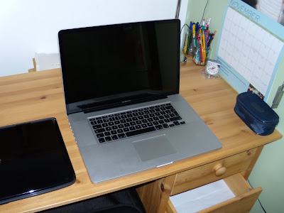
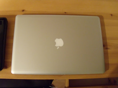
During the editing I have used two Apple computers. An iMac and a MacBook Pro. On these I have used iMovie to edit the film. For further information see my post on editing.
http://matthewharrisa2media4079.blogspot.com/2010/12/editing.html

To comply with exam board specifications I have used blogger to submit my work electronically. In the past I have had some difficulty with the site but when completing this coursework it has been fairly good to me. there has been no error messages bar one and I managed to work around that. The image uploader said there was an error with the images I was trying to upload for the editing post. The only reason it didn't like them was because they were screen shots I had taken on the MacBook Pro. So I went around it and opened them up in Windows Picture Gallery, which did recognise them, and took screen shots from there. I then dumped them into Microsoft Office Picture Manager and cropped them.

The cameras that I used to film the video were:

A Canon MD205 video camera.

A Nikon Coolpix P60 digital camera.
(it's really a photo camera, it just has a film mode built in)

...Planning?
In the planning stage I used a new website to me called Scribd.com. This site allows people to upload Microsoft Office word documents which can then be linked to things such as blogs. I uploaded my Shooting Schedule and Director's Pitch.
.
...Research?
During the research and TA research I uploaded the animatic to YouTube and sent out messages via facebook asking people to send me their thoughts. This allowed me to get a wide range of feedback and a good idea of what peoples general thoughts were.
.
...Evaluation?
During the evaluation I used no more new technologies than the ones I had already used in the rest of the project.

I used the Schools new VLE to have access to the evaluation questions and that's it really.

Evaluation: What have you learned from your target audience feedback?

From gathering audience feedback I have learned that the majority overrules.
From a business stand point it is more efficient to create a digipak that can be sold to the majority of the market rather than change it to meet the opinions of a hand full.
There have been a few criticising comments but I think by looking into them I have been able to see which is the better option. For example with the advert I looked into a green patterned design because someone said it was a bit plain. Only when I had both designs did I realise that the red one was better.
I have also learned that the target audience can be very sheepish yet firm. They know what they like and they will go with it following the leader. however if they don't like something then they will object.

Evaluation: How effective is the combination of your main product and ancillary texts?

Location
The video was originally set in London but due to travel issues we could not all make it down there to film. This meant that I had to settle for Northampton. Not exactly the best place in the world and no way near the same as London; but it had a park and that was good enough for me. I originally planned to film in St. James Park in London so I could disguise Beckett's Park in Northampton as London fairly easily. London is a big place and to the people who don't know where I actually filmed it looks like we did go to London. The street could be any street down in London; it's busy, there were buses and taxis. The only thing that may give it away is the landscape. Large areas of London are all relatively flat but there are visible hills in the video if you look carefully.

Fonts
Throughout the whole project anything related to the band such as the digipak and poster has all been in the same font and style for that matter. This shows clear continuity between the products. The font and style may seem a bit cliche as it is fairly commonly used in day to day things. I used Ariel Bold Word Art. It's not the best thing in the world but if you look back to my deconstruction of the bands album "Once Upon a Time in the West" it is similar to the font used there. The products are all red as well. The digipak and CD are red along with the advert in the magazine. They are all done in the same style which makes it easy for the target audience to recognise them.

Evaluation: My Video and Goodwin's Theory

My video follows some of Goodwin's theories.

In the video there are links between the visuals and the lyrics:
Two examples - When the lyrics say "I think you've turned it 'round" there is a still image spinning around.
- When the lyrics say "I saw this girls 'round town" there is a shot of the girl in the town among other people.

I like to believe that visuals compliment the music. The rushed and upper class images enhance the feel of the lyrics.

My video fits in with the genre characteristics and has a good resemblance to other videos in the same genre.

There is a fair bit of the Notion to Looking in my video. When the girl is walking up through the town the shots depict her as something to be admired and something that the guy wants to have.

I believe that my video comes under the category of concept based video. There is no direct performance (I would consider direct performance to include instruments) and there is a bit of a narrative through the video but it's not souley narrative.

Evaluation: In what ways does your media product use, develop or challenge forms and conventions of real media products?

My music video has used the basis of existing videos to create a realistic and typical theme for the music genre. Other music videos have given me a good and somewhat varied idea of what to include in my video. The first thing I did was choose the song, looking back I am glad it was a song that I had not seen the video to. This mean the ideas of what I put into the video would come straight from my head and the images that the song gives me when I listen to it.

By looking at other music videos I counted the scenes within each one. The average came to about 120 scenes. For an average four minute video it makes it about 2 seconds for each scene. This mean that to keep the video moving at a normal pace I would have to carefully use footage and make sure that I filmed enough. I managed to create a storyboard that was 101 scenes long so to fill the gaps I used stills.

My music video doesn't develop technologies as such. I think I have managed to create a developing sense of speed through out the video. As it gets further on into the song the pace starts to pick up and so does the video creating that feel of rush. This is helped by the stills of London that are included because it is associated with hustle and bustle of a rushed life.

My video challenges real media products because it has quite a lot of stills in it. In most music videos there aren't as many as this but I think that they are necessary to help create the atmosphere of the video. They are there as a constant reminder of the wealth the girl is related to and they bring the viewers mind beck to the city. I consider the city to be a key character in the video. There are so many people in London and the guy goes after this one girl. It also gives a sense of 'there is so much to do and see but the guy just wants the girl'.

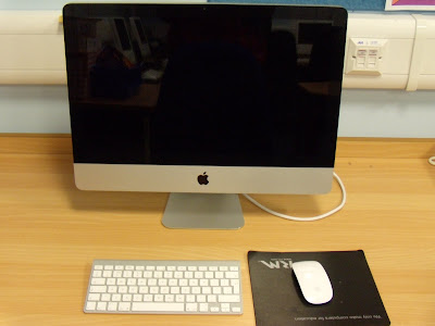
The iMac

The iMac that I used to start the editing was one of the very latest and has got all the new technologies with it.This is the new shape wireless Apple mouse. It allows for a greater range of movements and is more ergonomically designed than the old mice allowing for better comfort.
This is Apple's new wireless keyboard. It is very light and portable which means that I can type while looking for something in another part of the room. The slanted design makes it more comfortable to use than a flat keyboard.

Editing

I started to edit my music video on one of the Apple iMac's available.
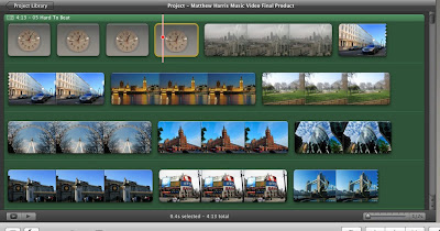
I used the iMovie software to upload my footage from the Canon camera. Because my filming had been split across two cameras due to batteries dying I had some filming on an SD card. Luckily there is a built in slot on the iMac for this so I could just select iMovie > Import Movies...
This allowed me to bring in the clips as they were from the SD card. There were more clips on the SD card as the camera saved them as individual files whereas the Canon camera recorded onto a tape which was uploaded as one solid clip.

I created a new project in iMovie and a new event. The event is where the filming is kept before it is edited. The title 'event' comes from the basis of the time it was recorded. For example a birthday, wedding or Christmas. The project is where all the editing happens and is titled project because it essentially is. You can bring clips from the wedding, birthday and Christmas togther in the project section as a montage.
I then decided after creating the first 14 seconds that I wanted to do all of the editing in one solid chunk. To do this I moved the files from the large iMac to the MacBook Pro. This also has iMovie and I just opened up the project in the program after inserting the file to where the project files are stored. I added the movie files into the events library and was able to do the editing in one weekend.
I used the clip editor to slow down and speed up the clip. This allowed me to get the lip syncing dead on as the clip could be slowed down by a percentage or sped up by a percentage. There was also another way of doing it, underneath the percentage box is a time box; so if I wanted a clip to be so long with no lip syncing I could just type the length and the program automatically worked it out.
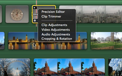
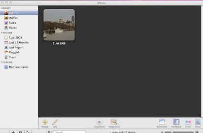
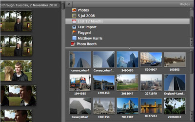
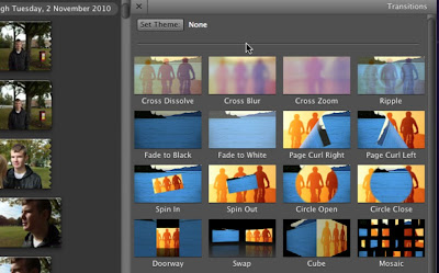
I inserted some still images into the film too. These were mainly to set the atmosphere of the video and create a busy city feel. I used iPhoto to insert the images I had taken from one of my annual London trips. The images were of many things but above all places that would be recognisable to the target audience. Some where of expensive cars and this helped denote the wealth implied in the film; the main concept was boy sees upper class girl > boy chases upper class girl and eventually boy gets girl. To zoom in on the images and give the effect of zooming I used Cropping, Rotation, and Ken Burns. The Ken Burns allows me to have a starting point for the beginning of the clip and a different end point at the end of the clip. Ken Burns then automatically creates a seamless movement between the two points. For the part of the video that mentions ''I think you've turned it 'round" I took a still image of London's Canary Wharf and used the rotation effects with transitions to give the effect of spinning. The transition I used was Cross Dissolve; this allowed the pictures to merge into each other with each one being a further 90 degrees around.
There are many transitions available but as it's not a film type production it doesn't need to have transitions. Transitions are more of a slow effect to add continuity between scenes which helps the story line move. In a music video straight cuts are the most common cut between scenes as the story line is fairly easy. The producers know that the storyline has to be easy to pick up in the short time that it's on the air other wise it won't make sense. This eliminates the need for transitions. The music also acts as a carrier of the story line which allows the video to flow.
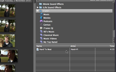
To import the song over the top of the video I used the integrated iTunes link. This is a perfect example of synergy within the software. It allows me to just click and drag the song on top of the video and it applies it self to the clip.
When editing I had to alter the level of sound on each individual clip. This meant opening the Clip Adjustments/Audio Adjustments and lowering the sound level to zero percent. By doing this the video should have played with no external sound from the clips. However when playing the video through in full screen mode and when viewing the video through a DVD some sound from the clips started playing as if it had never been turned off.
I later found that there is a small glitch with Apple's iMovie software in that if you use the percentage editor for the clip speed it doesn't alter the sound even if it show the sound level at zero. To combat this I tried removing the sound from the clip entirely. That didn't work as it cannot be done (to my knowledge). I then fiddled around with the Ducking Adjustments in the Audio Adjustments.
Ducking allows the sound levels to be altered when there is two or more sound tracks to a clip. The standard is set as 'Duck the levels of other sound tracks to 15% when this clip plays' I then altered this level to 100% so that the music would play at 100% volume over the top of the other sounds. I then altered the level of the music to 200% to make sure nothing could be heard.
Unfortunately by raising the music level to 200% the sound quality isn't that great when watched on YouTube.

Other Marketing

When a band releases a new album they generally do a tour to promote it. The tour will consist of television interviews and concerts across the country or globe.

This is what a poster may look like advertising a Hard Wi concert.

The concert tickets may look something like this.

Tuesday, 30 November 2010

My Final Production Hard Wi - Hard to Beat

This is a link to my music video. I filmed the video in Northampton and I have included pictures of London so that people think that the video is filmed in London.
The filming and editing took several days all together and it took time to get the lip syncing right.


Monday, 22 November 2010

Filming

Today we filmed in Northampton.
It was a really fantastic day. The weather held off until the evening and we managed to film in the park with little interuption.
We filmed up and down Gold Street first after meeting outside the VUE cinema. When we had finished the filming we ate at the original Buddy's and went home via train.


The backup camera came in handy and so did the back up batteries. The school camera ranout of power about 3/4 of the way through filming and so I used the digital camera of mine. The batteries in this quickly died and I changed them to get the last of the filming done.

Possible Filming Techniques: Boom Arm

To achieve a really long moving shot I could use an improvised boom arm. I have borrowed my dad's mono pod to try this out.

http://www.youtube.com/watch?v=7BEKyN7EMag

http://www.youtube.com/watch?v=oPUSb9Ifb2M

http://www.youtube.com/watch?v=xQ37RYhNdNY

I have found that the boom arm needs to be counter weighted. The camera at the top of the arm is weighty and pulls down the arm. When I am holding the arm it tends to shake and the camera wobbles. To balance this out it would need to be fitted to a rig that has a pivot point in the middle allowing for the camera to be slightly weighted against the counter weight. This way camera would move down in a fluent movement.

Saturday, 20 November 2010

Possible Filming Effects: Blood

The next technique I am have tried is blood. To create the blood all I used was pure red food colouring. I used in a sink for two reasons. One I wasn't aloud to try it on any other surfaces in the house and two it seemed like the best place to use it in a video.

The first attempt went wrong in a way because the sink was wet. This meant that all of the colouring bled into the water that was already there.

I realised that at the top where the sink was dry it looked better so I washed the sink down and dryed it out. By washing the sink down I could see that the colouring acted similar to blood.
http://www.youtube.com/watch?v=jqk1S4yCpyo

The second attempt was so much better. The fake blood looked life like and moved in the same way. It moved at the same speed and was dark enough too. If the blood does look a bit light in some places it can be put down to the sink being white.

http://www.youtube.com/watch?v=8Bigg1Po9jY

Possible Filming Effects: Police Lights

I have been looking into possible filming techniques that I could use in my film if I needed to.
As I have already storyboarded this should not be necessary but it's nice to know if the technique works or not.

The police lights effect can be created in a dark room with a pair of novelty magnet lights I bought years ago. They flash just like police lights and they reflect off of anything in the way of the light.
http://www.youtube.com/watch?v=c3YPxMadv6c


Monday, 15 November 2010

My Location

I plan to film in Northampton. On the map below provided by Google Earth there is a marked out area where I plan to film.

Beckett's Park provides the perfect green space in a town location for my video and the landscape's hills and hollers allow for the right effect.

My Equipment

This is the equipment that I have booked out for use over the holiday.

A Jessops Tripod.


A Canon MD 205 Camera.

For extra emergancy safety I will also be taking my digital photgraphy camera as it also has a film application with it. And to back up this I will be taking 3 sets of extra batteries. This way I know that I have enough back up options to get all of the filming done.

The Weather

Lately it has been very rainy but I have planned ahead and looked at the weather forecast for the shooting day.

Me being the ultimately clever person that I am I may have forgotten to scroll down to the right part of the day's weather. So now that section of the weather report is gone forever. However I can tell you that the next time frame was at 10:00 a.m. and it did say cloudy but sunny spells. I remember this because I remember thinking that it was just at the right time for when we would be filming. After that it said rain at 1:00 p.m.

I am going to take umbrellas anyway because I don't want to ask George and Emily into town and get them wet because that's just rude to say the least.

My Actor

The actor in my video is one of my best friends. I asked him at the begining of the year if he would star in my music video and he agreed. George Caswell is completing the same media course as me and while we have different songs with different concepts he knows what I have to achieve. This is helpful to me because he knows what the main aims and goals of the project are and what the breif is. He is also a keen musician like his girlfriend Emily Hare so they are on hand if I need any 'industry' advice.

Thank you George for starring in my film!

My Actress

This is the actress in my music video.

Emily Hare is a very good friend and has very nicely agreed to be in my music video with her boyfriend of two years + George Caswell.

Emily has also amazingly been so kind as tolet me have complete control over her hair and wardrobe. This means that I can create the right effect in my video.

I would just like to take the chance to say Thank you to Emily for being Great and starring in my video!

Planning: Preparation Including Porps, Equiptment, and Control of Location

I have found my two actors and we have set a date of the 23rd October 2010.
We are planning on meeting up in town and filming through out the course of the morning and into the afternoon.
The only prop needed in the film should be the girl's phone. My actress will have her phone with her anyway and if need be I shall have mine to hand that we can use.
The equipment needed will be one tripod and one camera. I have booked these out from the school media department.

The location is a public place and so I have no control over that or who walks into the shot but I think it will give the video a more realistic effect.

Planning: Shooting Schedule

To effectively and efficently shoot my music video I am going to need a shooting schedule.

The shooting schedule will enable me to know what I have and have not filmed. There is going to be three main parts to the shooting shedule.
The largest two sections will be the girl scenes and the boy scenes. In the middle of the two will be a mixture of the both where both characters are on screen together.

http://www.scribd.com/doc/42792318

Sunday, 14 November 2010

Planning: Final Storyboard

In my final storyboarding I am going to take out some scenes of the sky and some of buidings. This will enable me to focus more on the actual people and therefore the song. By having more shots of the girl the audience will want to see what she looks like more. Therefore this will drive the audience to watching the video through to the end.
This will then increase records sales.
After re-storyboarding I will organise the shots into the girl scenes and the boy scenes leaving the mixed few where both are in the shot in the middle.

Director's Pitch

Here is my directors pitch for the main concept of the video. It's a fairly simple concept that I think compliments the song well.

http://www.scribd.com/doc/42773405/My-Director-s-Pitch-for-My-Music-Video

Monday, 8 November 2010

Final Production of Magazine Advert

This is the final draft of the magazine advert that I have created to advertise the bands new album Stars of TV. The feedback on this advert was mainly good so I am keeping it the same as the original with exception to the line around the text which I have now changed to white so that it blends better with the background.I looked into an alternative concept for the advert based on what the audience research said. I thought that it could be really clever and have the same simple intelligent effect. Despite the fact the pattern I have used is green it still works essentially the same. The text is where it becomes clever. By layering the text on top of the opposite text in reverse it gives it a real mirrored effect. The text "Hard WI" is in the top on the left hand side of the image with the text "Stars of TV" underneath it in reverse. On the right hand side the text "Stars of TV" is on the top with the text "Hard WI" underneath. On each piece the text underneath is written backwards so that it looks like the image has been flipped.

This is what my advert will look like inside an actual magazine.

Final Production of Digipak

For the final production of the digipak I have taken some advice from the WALL.E Soundtrack and made the entire digipak, with the exemption of the CD, recyclable.
http://www.youtube.com/watch?v=_UUa87u9j6Q
I have decided to make the case out of a relatively thick cardboard which can be made from recycled card and paper. The front cover is plain and so is the inside panel. The back cover is plain but the real magic of this is the way the CD is held in place.

The inner back panel will have a hole cut the same size as a CD with two overlaps at the bottom to hold the CD in place. At the top of the circle there will be a little cut out that allows the user to grip the CD with a finger. The inside of the two overlaps will be hollowed out on the inside so that the CD fits in easier.


There can be some variation on this design because the inner panel to the front cover could be just a square frame that has no middle. This would create a frame like edge on the back of the cover panel; with two overlaps added it could hold an insert booklet about the band.

This is the final product. I am overly pleased with how this turned out and I love that the simple concept is in keeping with the bands image.

Here is the link to my final digipak construction.


http://www.youtube.com/watch?v=PcyngItc1XU

Research and Planning: Target Audience Feedback (Video)

The feedback I got from the video was also questioning into some aspects. four out of the six people that I asked said that they think it's alright or better. This means that the main concept I have for my video is right or there abouts.
Some people said they thought it went well with the song and the rhythm. This tells me that the timing of the scenes is correct and that the scenes are in the right places before I start to film the video. The main concept of the video relates to Goodwin's Theory's; it contains a lot of notions to looking and a large overall chase concept of boy meets girl - boy wants girl.

One person said that they thought it would be hard to get a clear shot if I was filming the video in town. I sort of agree with this but having other people around would make the video seem all the more real I think. It gives that atmosphere of a bustling community and a vibrant always moving work place of the city/town.

Another person said that it was alright but did not give an answer as to what could be improved upon.

Research and Planning: Target Audience Feedback (Advert)

The feedback I recieved from my target audience on the draft of a magazine advert was varied to say the least. Three people said that they thought the advert was effective and they liked the way it was laid out. The other two that I asked had differing opinions.

One person said that it was "very bold", this could be both good and bad for the advert. The boldness makes the advert stand out in the magazine and creates a certian impact which allows the readers of the magazine to slowly absorb it's message. The red creates that immediate WOW and BOOM effect leaving the reader to just read what the text says in the middle of the pages. The viewers eyes are immediatley drawn to this because the white stands out more than the red does as a brighter, bolder colour. However it could be bad to have the advert so bold as people may think that it is being preachy and in their face. This could deter readers from buying the CD or going to see the band.

One person said that it was quite boring and that there should be a picture in the advert. I am choosing to ignore this comment because the bands image is clean cut and simple. I am keeping with this image and the belief that an image would look too clutered and give of the wrong impression of the band.

Research and Planning: Target Audience Feedback (Digipak)

My target audience feedback on my draft of the digipak came back all complimentary.
I think I have found the right balance of contemporary modern simpleness that easily captures the bands individuality.
I have used ideas based on their other albums and their other covers to create an effective and different digipak for their album. The band is individual when it comes to CD cases and digipaks because they don't do the same 'mainstream' thing like all of the other bands/artists do. Hard Fi unlike other bands does not have an irrelevant expensive photo shoot with the band members in it; instead the band chooses to signify themselves by using primarily yellow with black and white writing or images. The images are usually computer generated and they have clean cut simple lines which gives the band a modern feel.

I feel that I have created a digipak worthy of the band and there is one more surprise I have left in store to distinguish it from other albums.

Research and Planning: The Genre

Hard Fi is an Indie Rock Band. Ultimately Indie rock is a sub form of rock that originated in the UK and the US in the late 1980's. The main roots of the genre lay in three or four different categories of rock: - Alternative, Post-Punk, and New wave are where the basic origins of the genre came from.

The term Indie comes from the saying Independent Music. The genre is not to be confused with Indie music.
The artists in this genre like to have control of their own music and they work hard to maintain the values of independence. To keep independence and control of their music the bands use only independent record labels. This means that the band can have control of their music and they do not have to bend the lyrics to what the major records labels would want. The major record labels such as EMI and Universal Music Group like to change songs that their artists write so that the lyrics are more politically friendly or less explicit etc. By making songs more acceptable the record label will sell more copies of the song and make more money.

I shall bare this all in mind when I am creating my products for the band because the band does not like to make a 'mainstream' fuss over what is happening in their career. Hard Fi uses primarily simple designs and ideas to attract fans and not loud outlandish statements.

Saturday, 6 November 2010

Research and Planning: The Artist

Hard Fi are and English Indie Rock band from Surrey. The band formed in 2003 with four members.

They achieved chart success with their third single, "Hard to Beat" and then followed by other successful singles such as "Cash Machine" and "Living for the Weekend", which all reached top 15 in the UK Singles Chart.

Their first album Stars of CCTV had three singles in the charts. "Hard to Beat" was the first single that got Hard Fi noticed as a band. This was followed by "Cash Machine" and "Living For The Weekdend".

The band was marketed to audiences mainly on the radio and music channels. The band also used poster advertising to project their record sales further.


After looking into all of the old covers that the band has had for various singles and albums I have found that the band likes to use bold colours mostly yellow to contrast well with black and white. This is a signifier that has been anchored into the minds of the audience. When the three colours appear on a CD cover it instantly reminds people of the band and by staying with the same style and colours it is a very effective way of creating a large number of record sales.

I plan to use the basic idea of simple is better to create my advert and digipak. This may sound easier but it's actually harder trying to get the right combination of things together to make it simple.

Sunday, 10 October 2010

Animatic Audience Feedback

I have asked for audience feedback on my animatic.


George Caswell - "it'd be a good video but i 'm not sure about the location and how there would be a clear shot"

Dominic Carson - "good concept, looks like a nice flow and has a good rhythm"

Jacob Dickens - "it's a good concept that fits with the song."

Beth Morrall - "I like the concept and the video goes well with the song and genre"

Charlotte Butcher - "I think it's really good."

Matt Hopper - "meh, it's alright I guess :)"

Music Video Animatic

This is my story board for my music video.
I have created this using still images that I have taken of slides that I have drawn.
At first I tried to do it in iMovie but the images kept on movnig. If i wanted the stills to move I would have made them move, but as I didn't I was left to use Windows Movie Maker. Movie Maker suddenly decided no matter what format the song was in it wasn't going to add it to my movie. I evetually gave up and so here is the links to both the song and the Animatic.

http://www.youtube.com/watch?v=IcKwUSNi0l4

http://www.youtube.com/watch?v=6cKNa0DQ0I8

My Target Audience

My target audience is mainly men from the ages of 14 - 45.

I have chosen to aim at this audience because the genre of music is listened to mostly by men aged 14 - 45.

Magazine Advert Audience Feedback

After asking some people what they thought to my advert concept I collected their feed back.

Jacob Dickens - "cool"

George Caswell - "it's effective because it's simple"

Beth Morrall - "it's a bit boring, put in a picture"

Jonny Langford - "I think it's a really good idea because it's not something you see everyday and more people would pay attention to it."

Charlotte Butcher - "it's very bold."

Draft of Magazine Advert

I must advertise my new album in a music magazine.
To do this I must create a magazine advert that is appropriate for the magazine and for my target audience.
It must also fit the target audience and give the right image of the band. I have created a draft of a magazine advert.


I think the bold red colour stands out and will make the page get noticed. It is also the same colour as the CD cover which sets an anchor in the audiences mind that it is all the same thing.

The white text stands out better against the red background opposed to black. The centre line that I have put in shows this well; it brings down the whole tone of the page. The real advert will have no border around the text. The white will just meet the red.

Digipak Draft Audience Feedback

After creating my draft of the digipak I asked some of my target audience what they thought:

George Caswell - "relative to the band, variation on a theme"

Marek Norfolk - "in keeping with the bands original style but innovative at the same time"

Jacob Dickens - "It's nice. It's like the original but the colour change will make it better."

Sonny Drake - "It's simplistic but it gets the point across."

Wednesday, 29 September 2010

Draft of Digipak

After looking at the current digpak I noticed that the camera style on the cover was quite old and needed to be updated.


I have decided to ask people which colour they think would be best for the new cover and digipak.


People decided that the best colour to have on the album would be red. I agreed with this and decided to make the new cover red.


This is the CD digipak that intend to have. The back will have legal requirements and a bar code along with a track list. On the cover there will be a CCTV camera and it will be more modren than the previous cover. This may be subject to change if I can find an optical illusion that suits the cover and album. Whilst this cover looks very similar to the previous one I think that it could be really effective. However I think that there is more here that I can do so that the cover is better than the original.

Tuesday, 28 September 2010

Music Mood Board

This is my Hard-Fi mood board. It shows the band in their formally and relaxed state which is reflected by their album and single covers. The covers use simple clean lines with minimal colours to show a relaxed, at ease attitude.

Wednesday, 22 September 2010

WALL.E

This is one of the most amazing digipaks I have ever seen.

It is completely Eco-Freindly and is made from card.

This digipak conveys the message of the film WALL.E as does the DVD release of the film also with a card case. One of the films main messages is that we cannot keep dumping rubbish anywhere.

http://www.youtube.com/watch?v=_UUa87u9j6Q

Hard Fi - Stars Of CCTV Digipak Deconstruction

This is the Hard Fi Stars of CCTV album digipak deconstruction.

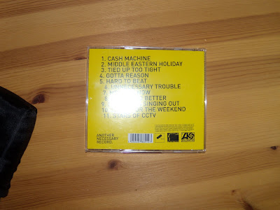
The album was first released in 2005 and was the band's debut album. The plain yellow front cover with the rather retro style CCTV camera is easy for the audience to recognise and it clearly signifies a camera. Today's cameras are more hiddedn and come incased in metal for their own protection and they might not be as recognisable on the cover.

The yellow colour follows on into the second album and has become one of the bands main signifiers in an album.


The insert is very plain and has no lyrics to the songs unlike the typical album insert. The pictures included are in black and white and they are of the band members.

Hard Fi - Once Upon A Time In The West Digipak Deconstruction

This is my favourite album in the world and there is a good chance that it always will be. It is the first real album that I listened to over and over and over again. It was a gift from my friend and it is the best present she ever got me. The album was released on September 3rd 2007. It wasn't just the music that appealed to me though, it was the sheer brilliance of it. The cover was just yellow with no art work just the words NO COVER ART and I thought that was above all genius!


The insert for the CD was a fold out and the this again was fantastic. One side was just yellow. The other side said the truth of what is actually in every digipak and in large bold letters were the words "INSIGNIFICANT PHOTOSHOOT" Brilliant!

There is no reference to looking.

There is no reference to the bands life or their performance.

The CD is just yellow.

The only text other than the titles in the digipak is legal dribble.

I also find the three colours great as the effect achieved by using these three simple colours is amazing.