Wednesday, 29 September 2010

Draft of Digipak

After looking at the current digpak I noticed that the camera style on the cover was quite old and needed to be updated.


I have decided to ask people which colour they think would be best for the new cover and digipak.


People decided that the best colour to have on the album would be red. I agreed with this and decided to make the new cover red.


This is the CD digipak that intend to have. The back will have legal requirements and a bar code along with a track list. On the cover there will be a CCTV camera and it will be more modren than the previous cover. This may be subject to change if I can find an optical illusion that suits the cover and album. Whilst this cover looks very similar to the previous one I think that it could be really effective. However I think that there is more here that I can do so that the cover is better than the original.

Tuesday, 28 September 2010

Music Mood Board

This is my Hard-Fi mood board. It shows the band in their formally and relaxed state which is reflected by their album and single covers. The covers use simple clean lines with minimal colours to show a relaxed, at ease attitude.

Wednesday, 22 September 2010

WALL.E

This is one of the most amazing digipaks I have ever seen.

It is completely Eco-Freindly and is made from card.

This digipak conveys the message of the film WALL.E as does the DVD release of the film also with a card case. One of the films main messages is that we cannot keep dumping rubbish anywhere.

http://www.youtube.com/watch?v=_UUa87u9j6Q

Hard Fi - Stars Of CCTV Digipak Deconstruction

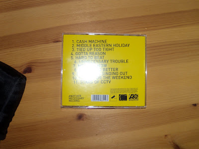
This is the Hard Fi Stars of CCTV album digipak deconstruction.

The album was first released in 2005 and was the band's debut album. The plain yellow front cover with the rather retro style CCTV camera is easy for the audience to recognise and it clearly signifies a camera. Today's cameras are more hiddedn and come incased in metal for their own protection and they might not be as recognisable on the cover.

The yellow colour follows on into the second album and has become one of the bands main signifiers in an album.


The insert is very plain and has no lyrics to the songs unlike the typical album insert. The pictures included are in black and white and they are of the band members.

Hard Fi - Once Upon A Time In The West Digipak Deconstruction

This is my favourite album in the world and there is a good chance that it always will be. It is the first real album that I listened to over and over and over again. It was a gift from my friend and it is the best present she ever got me. The album was released on September 3rd 2007. It wasn't just the music that appealed to me though, it was the sheer brilliance of it. The cover was just yellow with no art work just the words NO COVER ART and I thought that was above all genius!


The insert for the CD was a fold out and the this again was fantastic. One side was just yellow. The other side said the truth of what is actually in every digipak and in large bold letters were the words "INSIGNIFICANT PHOTOSHOOT" Brilliant!

There is no reference to looking.

There is no reference to the bands life or their performance.

The CD is just yellow.

The only text other than the titles in the digipak is legal dribble.

I also find the three colours great as the effect achieved by using these three simple colours is amazing.

The Feeling - Twelve Stops And Home Digipak Deconstruction

This is The Feelings debut album Twelve Stops and Home which was released on the 5th of June 2006. The band is English and from London. this album had twelve songs on it to correspond with the title.


The cover here relates to the title in a way. The title uses the word 'home' and the front cover, insert and case are comprised of mainly things that you would associate with home. There is a key, a pen, playing cards and what appears to be a glasses case, these are things that you could find in a bag that you would take with you when you leave your house. It could represent taking a part of your house with you. The link between the title and the visuals displays Goodwin's first theory.
The cover is very attention grabbing with the use of bright colours and fits in with the genre characteristics. Most pop-rock bands have pop out covers that stand out in the stands. This also fits into Goodwin's theory under the genre characteristics rule.
There is no real notion of looking on any of the covers that I have looked at. I think bands want to appeal more to a unisex audience so that they can sell more albums. However this may not be the case the record label is probably the one saying that there can't be a half nude woman on the front of an album as they will be accused of being sexist.
Voyeurism could be the key here as all of the things on the cover and in the fold out are about life and the daily life of people.

The Kaiser Chiefs - Yours Truly, Angry Mob Digipak Deconstruction

The Kaiser Chiefs released their album Yours Truly, The Angry Mob in 2007. The cover and contents of the digipak are very simple. They are a perfect example of what you should expect to find in any digipak.


The cover of this album is very simple. There is no special graphics or extreme photography. It's simple get pictures of the band members individually (we know this from the depth and distance from one another) and put them in a line at the bottom of a blank sepia tone canvas. Add in a fancy title with the same font as the band name.
The digipak insert is one of the most standard typical booklets you could find in a CD. The are a few photos of the band doing strange things and the lyrics of the songs are on the panels opposite them. It was once said (and I will refer to this in a later post) 'insignificant photo shoot' was the only term to describe the photo's in the insert. I find this to be completely true. I mean what relevance does eating beans have to do with anything in this CD?
The yellow like colour of the cover allows for the audience to feel relaxed with the CD and the music. If it was fluorescent yellow or bright yellow it may provoke a different reaction.
This digipak fits in perfectly with it's genre characteristics. The digipak itself is again held together with staples.

The Hoosiers - The Trick To Life Digipak Deconstruction

This is The Hoosiers album The Trick To Life released, a year later than The Killers Sam's Town, in 2007.


This is one of the cleverest album covers and digipaks I have ever seen. The band came up with a simply genius way to appeal to their audience. Change the colour. There were four different album covers. Each had exactly the same graphics and information but the colours were different. There was a choice of red, yellow, green or blue. My favourite colour being green I bought the green one. However now my favourite colour is red so a bad choice in the long run.
The inside of the digipak is what you would expect to find inside your typical CD. I guess to some people it may be considered as being a little more 'main stream'. The insert has a little legal section towards the back and the rest of the digipak is just the lyrics to the songs. In fitting with the style and main theme of the CD the images are all cartoon graphics. The graphics relate to the songs and the lyrics/story that they tell.
The cartoons themselves are very meaning full. Each one is a grey, round faced person. This is so that they do not distinguish any social or ethnic group from others and it means that they are not being discriminative.
The Images relate to the Lyrics like rule 3 of goodwin's theory states.
This pak was alos held together by staples.

Digipak Deconstructions

I am going to deconstruct six digipaks to see what makes them good inserts for compact discs. To deconstruct them I will be looking at various aspects of the booklets and covers such as pictures, text, colours, font and content.

The first digipak that I am going to deconstruct is from the CD that The Killers released in 2006. Their album Sam's Town was a massive success.


The cover and back panel of the digipak illustrate an image of people camping in an out back somewhere. Judging by the sand like floor and the grasses I'd say it is somewhere in central lower America like New Mexico.
The colours that they have used are only black and white. All of the covers and main sections are in grey scale giving the CD the edge against others that try to pop out from the stands. Sometimes when there is a lot of colourful competition it is best to stay back in the greys and you'll manage to stand out that way.
The CD has a ram's head on it signifying that The Killers are not to be messed with or crossed. It also shows that they command respect.
Inside the digipak there is actually a few more colours although the main theme still remains in grey scale. There is a red border to those panels which have some writing on them. Unlike most digpak's, the panels in the digipak that do have writing on them aren't song lyrics. The writing on these panels is all legal terms and thank yous. These thank yous allow the audience to connect with the band but not directly. The vast majority of the audiences name's are not on there and it is only a select few that are.
The main theme of the pack is Native Indian American vs. American Western Cowboy. This is why the cover and photo's are set where they are, the background represents Indian ground that was taken over by the cowboy's for ranching purposes.
The digipak is held together with staples as opposed to being a fold out like some digipak's are.
There is definately a notion of looking on the front cover with the woman in the swim suit.

Tuesday, 14 September 2010

Copyrighters Permission

I have sent this email to the Warner Music Group to obtain copyright permission for the use of the song.

"Dear Sir or Madam


For our ‘A’ Level Media Studies coursework we have to make a music video to accompany a song. For our project we would like to use Hard to Beat by Hard Fi and are seeking your permission.


The resulting music video will not be used for commercial gain, will be hosted on a private coursework blog and also rendered on to DVD for the attention of our teacher and the coursework moderator. Should we not hear from you to the contrary within 14 days of the date of this email we will assume that your are happy for us to use this music under a fair use arrangement.


Should you require any further information please contact our teacher, Mr Scargill on scargill@guilsborough.northants.sch.uk


Yours faithfully


Matthew Harris"


Digipaks

A Digipak is described as the insert in a compact music disc.
It is usually a cover for the disc casing and most of the time will contain lyrics to the bands songs.
It may also contain the copyrighting information for the disc and the information on the band. There is a good chance that there will be some thank yous from the band.

Wednesday, 8 September 2010

The Why of Hard Fi


I first heard Hard Fi on the way home from a friends house in her dad's car. It was a CD so when she asked what I'd like for Christmas I said the same CD that's in your dad's car. Of course then I had no idea what band it was or what the songs were called.

This was in 2007 and I was completely unaware that the band was the same band I liked from a compilation CD I had bought in 2005. Now 61 was released in 2005 and when I bought it I took a particular liking to tracks 11- 17 of disc 1. One of these songs was Hard Fi - Hard to Beat.
So I guess one could argue that it was my subconscious that recognised the music style in the car.

One of the reasons that I liked Hard Fi so much when I heard the album in the car was because of the type of car and my friends life as it were. My friend was Emily Burkimsher and her dad had at the time got a BMW 3 Series. My family could never own a car like that and at the time I was setting out my aspirations in life. I put two and two together to come up with the conclusion that this is the kind of music that successful business men listen to in their nice cars and set it as an aspiration to one day do the same.

So the real reason behind this song is because I think I can create a better video for this than I could for The Funeral and a video of the same quality of video as Walking on Sunshine.
I had a rough idea in my head to try and get down to London to shoot the video for both Walking on Sunshine and Hard to Beat.

Tuesday, 7 September 2010

My Chosen Song

I have decided that for this project I shall work alone and create a video to the song:

Hard to Beat by Hard Fi

http://www.youtube.com/watch?v=6cKNa0DQ0I8

I have decided to work on my own as I find it is easier to get things done that way. you are not constantly relying on other people that you can't trust to complete a task you say needs doing.
I have two people that I wish to star in my video. George Caswell and his girlfriend Emily Hare are the two people I hope will star in my video. George is one of my best friends and I can trust him with anything, he has already said to me that he would be able to star in my video. Emily has said she would be in my video if I'd like her to be but I just need to confirm it with her. Emily is very reliable and knows me well, although not a media student she has a keen interest in music.

I have chosen this song because it has the fast pace and beat that I'm looking for in my video. I narrowed it down from three songs I had chosen based on rough ideas of what I could do for each one.

Band of Horses - The Funeral

http://www.youtube.com/watch?v=ibE7IqEjni4

Hard Fi - Hard to Beat

(link at the top)

and

Katrina and The Waves - Walking on Sunshine

http://www.youtube.com/watch?v=iPUmE-tne5U&ob=av2e

Friday, 3 September 2010

Evaluation of My Test Music Video

My test music video went really well although there was a time when I didn't think I would get it finished.

The main concept of the video was to have things happening in the background that related to the lyrics of the song. For this I needed an open blank canvas behind George (the person starring). I looked into hall ways and out side spaces that had a flat surface to roll the dolly along. Any or too much vibration would have ruined the recording. Finally I settled on the out side bus park as it is new and freshly paved - smooth.

I decided to have George walking as the song tells a story and walking would give a continuity effect. It worked really well I think, if he had just been standing still then it would be a bit boring.
I wanted the animations to only be about the key words that way it would give me time to do something with them in the space of the less key words.

To create the animations I used a green screen background and cut out drawings. First I had to draw the item and the cut it out. When I did this for the first time the pencil drawing did not show up well. To combat this I went over it in black felt tip pen. After I had done that the colour contrast made the drawing more prominent and it was clear to the iMac. I then BlueTacked the drawing onto the green screen and took a photo of it in Photobooth. This then automatically appeared in a side window in iMovie. From there I imported the image and used the green screen filter. Much to my disappointment iMovie was being awkward and did not show the image correctly. I tried playing around with filters and such to correct this and found that the best one was x-ray.

I spent about an hour going through the whole clip converting each and every image to x-ray. The next day I came to open up iMovie and the colours were all different again. I then found out that through some obscure channel and way of thinking iMovie needs just one of a series of green screen images to be converted into x-ray filter before the program is closed. Upon re-opening the program the image set will be fine again and normally coloured.

After tweaking a few things I burnt the movie and was pleased to see it in good colour.


With special thanks to Georgina Pacey for helping me cut out my drawings and George Caswell for being a fantastic star!

My Test Music Video

I have made a Test Music Video to Randy Newman's Strange Things.

The song is most recognisable from it's role in Pixar's Toy Story.


I have taken the song and created a video around the lyrics. I have used only one shot for the video to enhance the animation that I have put in via green screen.

I tried to make it so that the lyrics were reflected in the green screen animations. Although the animations were roughly drawn and kept on moving on account of the Mac software I think the intended affect was achieved.

Here is a link to my video:

http://www.youtube.com/watch?v=E3joLEwDNsM

Second Music Video Deconstruction

This is the ultimate concept video. I will be deconstructing it looking at the same things as I did to deconstruct Adele's video.

Sigur Ros - Hoppipolla

http://www.youtube.com/watch?v=4L_DQKCDgeM

There is roughly 120 shots in the video and they are used to emphasize certain parts of what is happening on screen. The fight scene uses small clips and the shots are a lot shorter to put emphasis on the battle.

The camera movement through out the video is slow and it enhances the effects of age following the theme in the video of the elderly. The main concept is the elderly people acting like teenagers and causing mischief like teens do.

Through out the video there is constant near dark filter around the edges of the video to show the grey colours of living in a town.

The locations are fairly close together in the eyes of the viewer because the near dark filter stays constant through out giving the impression that they are all in the same area. The actors and actresses are in the same clothes through out the video which also gives the illusion that they are in close locations. However for all we know it could have been filmed across two different towns.

The composition of shots is very varied and there are parts of the film that jump from close ups on the face to feet. It helps to emphasize certain parts of the film like jumping in puddles.

This song falls into the genre of post rock. Post-Rock uses the instruments of typical rock music but to a harmony or a rhythm. The video is a concept video and therefore does not fit into the genre.

There is no reference to the notion of looking .

There is no reference to any other texts.

Thursday, 2 September 2010

Music Video Desconstruction

I am going to deconstruct two music videos to find out what makes them appealing to the audience but for easiness sake I will be writing them up in two posts as blogger can sometimes be a 'little' awkward.

The first video that I am going to deconstruct is Adele - Hometown Glory

I will be looking at Number of Shots, Camera Movement, Colour Schemes, Number of Locations, Length of each shot, Composition of shots (including speed and type)

http://www.youtube.com/watch?v=MixzjwDFSvM

This is a rather odd and yet brilliantly fantastic music video. It's amazing how so much effect can be achieved from this.

There is only one shot through out the whole film and the camera moves around Adele's face and person to reveal different backgrounds which give you a window into her life and memories.

The camera movement is fluent and smooth, there is no jerking or jolting of the camera. The odd very subtle zoom in and then out compliments the artist. It is because of the camera movement that we are able to see the different backgrounds.
The set is a studio and the film does not move out side the studio. The audience is very aware that it is a studio and the record label has not tried to cover it up. Like in a photo shoot the backgrounds are on material and are moved in and out when they are behind the camera. She is sitting on a stool in the middle of what is essentially a box of backgrounds.

The colour schemes through out the video are mostly greys and a few bright colours slip in to enhance the artist against the greys of the city or 'Hometown'.

The composition of shots is key to this video. the long shot reveals her on the stool. It then zooms in to her face and the back ground lights up. As the camera zooms out the lights go down and it then zooms in on her face again after panning around a bit. This gives the illusion of Adele being in the background location.

I have noticed that there are no wires on the floor and so the camera must be a satellite camera that is not on any rails or connected via wires.

The video does not fit in with the Genre Characteristics of a pop video as there is usually more action and a more up beat rhythm.

The background visuals relate to the lyrics Adele is singing at the time. When she sings
"I like it in the city when the air is so thick and opaque" a picture of an oil refinery appears as the background.

There is no noticeable reference to the notion of looking.

There are no references to any other texts.

Hybrid Videos

Most music videos are hybrids that combine any of the three types of video together.
To please the audience the record label may want more shots of the artists face and this increase the percentage of the video that is performance.

For Example:

The Script - The Man Who Can't Be Moved

http://www.youtube.com/watch?v=16nOViwmSJ4&feature=channel

Concept Music Video

A Concept Music Video Generally has very little to do with the music or the lyrics and can be anything from just a video that would suit a different genre or it can be the craziest outlandish video there is. However most concept videos are hybrid videos and they contain a certain level of performance to please the audience at the record labels demand.

Vanessa Williams - Save The Best For Last

http://www.youtube.com/watch?v=5EdmHSTwmWY&ob=av2e

Narrative Based Video

This is a Narrative Based Video because the video reflects the lyrics. The lyrics are about loosing someone close to you and the video reflects that by being made of home videos and clips of what the artist has accomplished in her life that the person didn't get to see.

Mariah Carey - Bye Bye

http://www.youtube.com/watch?v=UqfLVDIZcP8&ob=av2n

Performance Based Video

This is a Performance Based Music Video because of the artists performance in the video.

The Editors - Racing Rats

http://www.youtube.com/watch?v=4uSqbMGGFDI

Goodwin's Theories

Andrew Goodwin Started out life being the Director of Music at Bangor Cathedral and has since progressed to build a theory based on music and the music videos that accompany it.

Goodwin's theory is based on 8 main principles:

1. Links between lyrics and visuals.

2. Links between music and visuals (Complimentary, Contradicting or Amplification).

3. Genre Characteristics.

4. Inter textual Reference.

5. Notions of Looking (Women as objects).

6.Voyeurism (Anything that focuses on looking at the artists life or soul, Mirrors, Direct eye shots)

7.Demands of the record label in terms of how the artist is represented.

8. Performance based, Narrative Based or Concept Based music videos.